New Eyes

A new way of looking at old stuff

Take a step into 1864!

I’m excited to announce the launch a site that I have been a part of producing! The site takes a look at The New York Clipper from April 2, 1864.

Entitled The Clipper Projectthis education and research based site will provide resources for academia and students to gain more knowledge about the nineteenth century. More specifically, this paper focuses on theater, sports, and other entertainment.

If you’re interested in urban history, sports history, theater history, or other types of entertainment you must check out this site!

Thanks for a great semester all!

A Look into the Wireframing Process

I am in charge of the digital aspects of this group project, including in that is mocking up the wireframe. I took ideas that my group had discussed during class and tried to integrate them into my wireframe. As a group we decided we wanted something that displayed a large amount of information, but in the simplest way possible. Additionally, we wanted our website to be appealing to the three personas we are using (history professor, student, and theatrical producer).

I decided to draw wireframes for our ideal website and a realistic version of what our website will be. Here is the wireframe for the ideal website:


If we had more time to work on this project and a greater knowledge of website development, it would be possible to create a complex website. The ideal website contains a flip-book or slide-show type format for the main page stories, similar to what Yahoo! features. I thought we could use pictures from the original newspaper in this format.

In the realistic wireframe, I had to be much more basic because I will be using WordPress as a platform to create the site:

Unfortunately, WordPress does not allow users to get super creative without paying money for a cool layout. On the bright side, by using WordPress it will ensure that our site is very basic and easily navigated.

Overall, I found the wireframing process to be very easy. I purposely avoided using computer programs to wireframe our site because I knew it would be very time consuming. Although my hand-drawn wireframes may look a bit messy, it was much easier to translate my ideas onto the page.

Imagining a Digital Persona

Image

When marketing any product, a potential audience is needed in order to create the best possible product for the highest profit. My product, a historical website, needs to be marketed to a tailored audience.

Going into this assignment I was extremely confused about what a persona is, how to go about creating one, and what information should be included in it. Thanks to google, I got on the right track pretty quickly.

I came up with a persona for a history professor. I researched online what academics in history are most looking for in internet sources. I used General Social Survey in order to gain insight into what academia requires and prefers in learning resources. I came up with Steven, he is a man focused on his academics. He really enjoys engaging his students through the use of multimedia and continues doing his own research outside of the classroom.

Overall, this assignment was a very new concept for me. It was a challenge to understand how to compile a persona, but after I got the hang of it I definitely can see how it can be useful to marketing a product.

What is a digital narrative?

What is a digital narrative? For me, a digital narrative involves any type of storytelling through the use of digital media. Digital media could include youtube videos, games, podcasts, or any other type of digital media. The most important part of a digital narrative is that it involves the emotions of the listener/view/reader – its how history becomes a story.

I checked out a digital narrative called Pine Point Revisited. The concept of the narrative is exploring a town that no longer exists through the use of videos, pictures, and interactive storytelling. I enjoyed this website’s story and had fun exploring the website.

The combination of video, text, and pictures helped to keep me engaged. I especially liked that the author did a modern version of text overlay in the videos. The text overlay helped to give context of what was going on in the video and at the same time keep me engaged.

Final Project Brainstorm

Our final project is our culminating moment in this class. Putting together everything we’ve learned and critiqued into one project. I wish I could say I was full of amazing ideas, however, I am completely lost.

As a starting point for brainstorming, I reflected upon the websites we’ve looked at in class that  I liked most.

  • I liked the concept of the Digital Harlem archive: using mapping to display information which would traditionally be displayed through text. It would be cool to do this, however, a crap-ton (yes, this is a scientific measurement) of work.
  • I really enjoyed the New York Public Library’s Digital Gallery and I would definitely like to incorporate this database somehow into my final project.
  • I like the idea of The Food Timeline, but from my previous blog post it is obvious that I found some major flaws in that site.

That being said, here are some basic ideas and interests that I have for a final project.

  •  I would like to do something with art. I loved the Thomas Cole series we looked at. I feel like the series really represents and epitomizes all the reasons I love to study sociology and history. I also really enjoyed putting together and writing my blog post ‘The Changing Landscape of 19th Century New York‘. Maybe I could use photos or paintings from the NYPL Digital Gallery to put together a website. The site could show some sort of comparison between 19th century paintings of metropolitan landscapes and photos of the same landscape (kind of like I did in my blog post).
  • I am really into tattoos and body modification. I was thinking about doing something with this, but I got discouraged when I could only find a few 19th century photos on the NYPL Digital Gallery of tattoos.
  • Mapping also interests me, but, again, I have no idea what I would map and it seems like a lot of work to put together that kind of archive.
  • Do I even want to digitize? I am not even sure if I have the time commitment available to digitize a bunch of stuff
  • I love baking. Maybe I could put together some type of website which takes old recipes and makes new, updated versions with pictures of each step.(I’m thinking like the recipes that The Pioneer Woman posts) They could also have a ‘modern twist’ and use modern ingredients. Again, this might be too much of a time commitment.

A Digital Exploration of Harlem’s History

The University of Sydney’s Digital Harlem site is a masterful combination of mapping and urban history of people, events, and places. The site uses Google Maps in order to visually display a database of information on New York City’s neighborhood of Harlem between 1915 and 1930.

The website provides an easy to use search function, and even provides a quick blurb of directions when the page first loads. It’s convenient that when a tab at the top of the page is clicked, the text opens in a box overtop of the map. Although the font is a bit small even for my young eyes, the overlaying features allows users to not lose the data they have pulled up on the map when they click a link.

I clicked around for about an hour on the Digital Harlem site, pulling up different events, people, and places, seeing how they intertwined. The comparison I found most interesting was looking at the locations of African Americans and whites in Harlem.

The red icons indicate records of African Americans and the blue icons indicate records of whites. I find it interesting that the whites stay centralized in the heart of Harlem, while African Americans are concentrated in Harlem and further South. By further comparing locations of churches, entertainment, and income of areas it may be possible to find out why the stratification occurred.

Although the basic function of the website does its job well, I wish there were some enhancements to the site. I wanted there to be a way to ‘connect’ events to other events, people, and places. I tried searching a few items that probably had connections, but there was no way to see which items were related. For instance, car thefts and car accidents, as well as police raids and speakeasies. It would also be very useful to stratify events, people, and places by date (1915, 1925, 1930) after already searching for the items. It seems like too much work to search 3 separate times for the same item, just changing the date.

I would definitely use this site and recommend this site to others doing research on 20th century Harlem. The visual aid of the map offers an experience that reading books and articles cannot. By seeing exactly where events occurred  especially if you’re unfamiliar with the area, can aid in comprehension and help things to click. Overall, I would give the site 3.5/5. With a few updates and enhancements, this site could be near perfect!

The Changing Landscape of 19th Century New York

The New York Pubic Library hosts a digital database of photographs, maps, manuscripts, and other historical documents and I love the website. I think this is the first time I’ve said that on this blog. I really do love this website. All the database pages are easy to navigate, and it’s very user friendly. The search function pulls up a variety of documents in a timely manner. The color scheme of the website isn’t distracting from the content. The pictures are easily viewed and resized. I don’t think I have anything negative to say about this website, actually.

Throughout the 19th century, the landscape of the metropolis of New York went through many changes. In class we looked at paintings by William Chappel which illustrated the landscape of New York in the early 19th century. The NYPL digital gallery comes in handy by providing photographs from the late 19th century in order to compare how the urban landscape changed.

Fireman’s Washing Day by William Chappel (1810)

Fighting a Fire by William Chappel (1809)

From these two images by Chappel we can observe a rather suburban-y looking New York (suburban-y by today’s standards). When we compare them to photographs taken at the end of the 19th century we can observe the changes that occurred in New York.

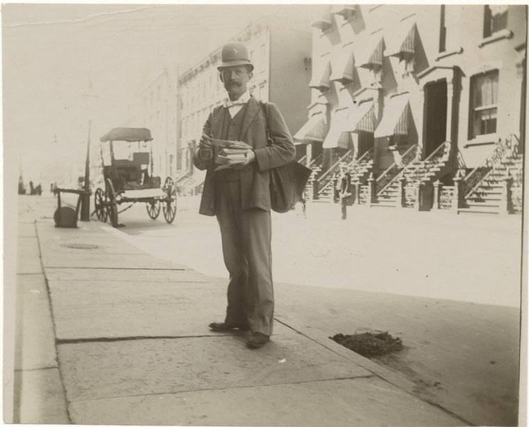
Postman by Alice Austen (1896)

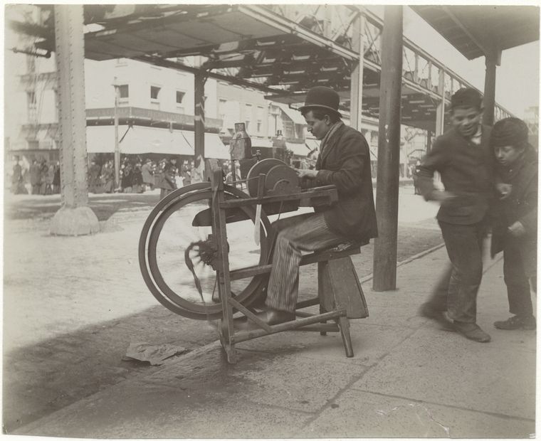
Grindstone by Alice Austen (1896)

[West 21st St. – Ryer Mfg. Co. – Sternberger, Sinn & Co., brokers Dunlap & CO, hatters – No. 182 Pennsylvania R.R. Co.] published by Wells & Co. (1911)
Click Image to View Larger

By comparing the paintings by William Chappel from the early 19th century and photographs taken at the end of the 19th century, we are able to see the differences in urban landscape, which occurred largely due to advancements in technology. Compared to Chappel’s paintings the photographs feature paved roads instead of dirt. In the image “Postman”, we can clearly see a car in the background and the paved street the postman is standing on. In Chappel’s painting “Fighting a Fire” we can also see a car, but it is obvious by the coloring that the sidewalk and street are made of gravel and dirt.

The second image, “Grindstone”, features an important advancement in technology: the elevated railroad! Again in this picture we can see the paved sidewalk and the cobblestone road. The last picture, the panoramic published by Wells & Co., shows (if you zoom in far enough) both cars and horse-drawn carriages. Again, the image shows paved streets. This image also shows the difference in the building type between Chappel’s time and the end of the 19th century. In the later image, the buildings have become closer to what we would now consider metropolitan- taller and less ‘suburban house’ looking.

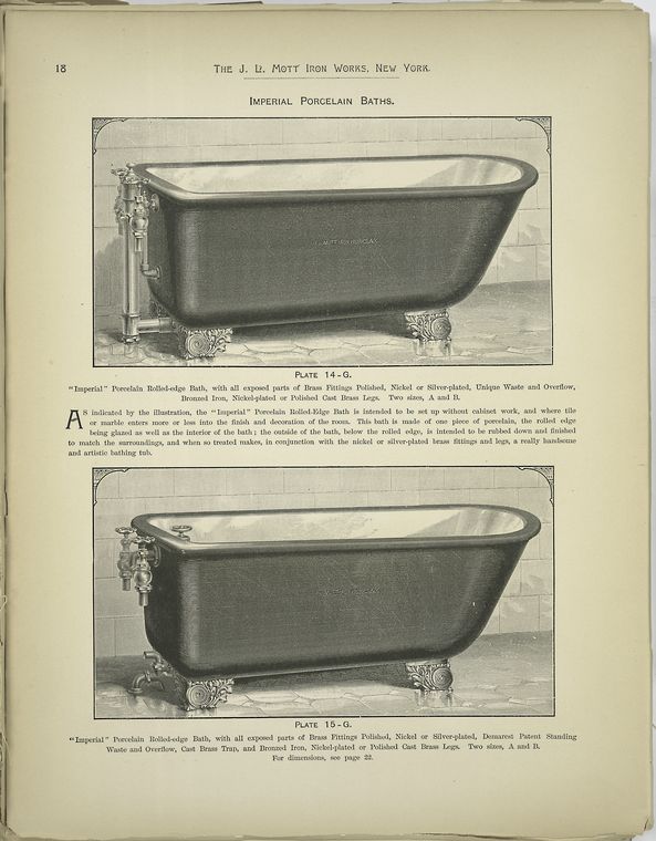
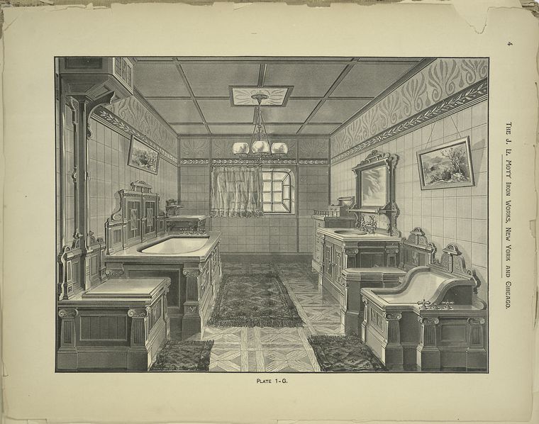
While browsing these archives I stumbled upon another landscape which was changed by new technology: sewage, and in turn, the bathroom. The 19th century was when modern sewers and plumbing evolved. As these technologies grew more modern, the upper-classes enjoyed luxury bathrooms.

‘Imperial’ Porcelain Baths published by J. L. Mott Iron Works (1888)

Bath Room Interior by the J.L. Mott Iron Works (1888)

New technologies of the 19th century changed the way New York looked – from the inside and out. Streets became paved with the invention of the car – a transition from the once dirt and gravel roads. The elevated train created vast transformations in the appearance of the New York City streets. On the inside of New York City apartments, the improvements to plumbing encouraged the upper-class to purchase and design luxury bathrooms.

To conclude, NYPL Digital Gallery provides a fantastic database of historical documents. I would easily visit this site again as a resource for historical photos or other documents.

Everything connects.

The industrial revolution caused drastic changes in social life, culture, the economy, gender relations, and the work place all across the world. I have been learning about Europe’s industrial revolution in another history class I am taking this semester, and I saw connections between that class material and Burrows and Wallace’s chapter “Eight Hours for What We Will”.

Burrows’ article highlighted the changes in both social life and work life that came out of industrialization. The 8 hour work day, as Burrows says, gives workers the ability to take part in society. They can now go see exhibits at museums and shows at theaters, things that were previously reserved for the elites of society. However, these changes come at a price. Social tensions are heightened by the Eight Hour Law being enacted in April 1867; money problems of the owners and managers of factories are blamed on the workers as they cut their hours.

The change in gender relations due to industrialization should also be mentioned. The threat of women taking men’s jobs and women becoming involved in work outside the home was encouraged by industrialization. Even after campaigns to equalize men’s and women’s rights, such as that by the New York Marxists and Lassaleans, women still remained unwelcomed in the labor market. I found it innovative that women’s labor groups formed alliances with women’s suffrage groups; a pairing of two groups which provide advocacy for very different groups of people can make for a messy recipe.

Industrialization not only effected social relationships, it also created change geographically; the industrial revolution went hand-in-hand with urbanization. Burrows’ points about the working class living in close proximity to their jobs reminded me of Burgess’s Concentric Zone Model. In Burgess’s model, similar to Burrows’ points, the working class live in “the transition zone”, the low-class neighborhoods, so that they are able to walk to their jobs.

Burgess’s Concentric Zone Model
The image gives a visual representation of how geographical neighborhoods look.

Exposition: Wiki-ography

Last semester I took HIST 291, which focused on historiography of 20th century French works. This assignment brought me back to that class. I’d like to thank Dr. Schloesser for all the great things he taught me last semester, most importantly how to read while not actually reading.

The Wikipedia article “Centennial Exposition” argues that the Centennial International Exposition of 1876 was the first official world’s fair. This article discusses cultural, technological, and urban history about a large gathering in the city of Philadelphia, which exhibited advancements in technology and the arts. Hosted in Fairmount Park, the Exposition was designed to be a celebration of the 100th anniversary of the signing of the Declaration of Independence. As this is a Wikipedia article, it was edited by multiple authors (in this case, users of Wikipedia). The last edit was made on January 26, 2013.

Opening day ceremonies at the Centennial Exhibition

Sources are one of the most important aspects of an article or book when doing a historiography. Through sources the reader can tell if the authors provided a bias source of information, from only one point of view. (e.g. A book on how socialism effected history only used socialist sources.) The reader can also see what time period the author gained his or her information from; different time periods provide different prospectives on history. (e.g. Present day writers look at women much differently than authors in the 1970s.)  I was surprised to find that this article did not make use of any newspapers articles from the time. As a public event, a world’s fair, there had to have been several newspaper articles about the events of the day. The sources used by the various authors are books – from both present day and the 19th century. Books on Philadelphia’s history are used multiple times by the authors: Philadelphia: A 300 Year History by Nicholas Wainwright and Philadelphia’s 1876 Centennial Exhibition by Linda Gross are two titles used. Both of these titles are modern publications (1982 and 2005, respectively). A Century After, picturesque glimpses of Philadelphia and Pennsylvania, edited by Edward Strahan, was one of only a few books fromt he 19th century used for this article (published in 1875).

The section titled “Planning” argues that the financial planning of the Centennial Exposition was difficult at first, but became easier as the Exposition gained support from members of the community. After planners of the Exposition gained support from large contributors to the community, like the Franklin Institute and the Philadelphia City Council, more individuals came forward to show their support. Individuals helped to raise money for the Centennial Exposition, and small-businesses contributed what they could. On a side note, it took around five years to plan for the Centennial Exposition.

The section titled “Structures” argues that planning fo the structural elements of the Centennial Exposition did not go as originally planned. Originally, it was intended for a design competition to take place in order for several buildings to be designed to hold exhibition sites and events. When commissioners realized none of the finalists provided a sufficient plan, they called upon a Philadelphian duo of an architect and engineer. In total, 200 buildings were constructed on the grounds of Fairmount Park to house the Exposition. However, today the only two remaning buildings are the Ohio House and Memorial Hall.

The Ohio House

Memorial Hall

The section titled “Exposition” argues that the Centennial Exposition successfully drew visitors despite changes in scheduling and weather. The Exposition was open from May to November of 1876 and drew a total of 10,164,489 visitors. Big name stars like President Ulysses Grant and Brazilian Emperor Dom Pedro attended. The day with the highest attendance was Pennsylvania Day, a day which celebrated the 100th anniversary of the Pennsylvania Constitution of 1776.

The section titled “Exhibits” argues that the exhibits at the Exposition were designed to show off the industrial power of the United States, introduce new technologies, as well as Celebrate the United States Centennial. The Corliss Steam Engine was one new technology that was introduced at the Exposition of 1876, as well as Alexander Graham Bell’s telephone. The right arm and torch of the Statue of Liberty were also on display to vistors of the Exposition.

The interior of the main exhibition building

I enjoy using Wikipedia as a starting point for papers and projects when I have no idea about a topic. If I was doing a project on the Centennial Exposition, I think this article would provide me with a lot of great starting information. This article gave many names of people involved in planning that I could go do research on individually. One thing I cannot comment on is the accuracy of this article, as I have no past information on the Centennial Exposition. If the information is wrong, the authors did a great job of tricking me! To conclude, the Wikipedia article on the Centennial Exposition of 1876 provides an overview of the purpose of the event, planning, and exhibits showed. Although the sources from the 19th century could have been more extensively used, the authors of the article did a good job providing a cultural, technological and urban history.

PT Barnum Needs a New Web Designer

For this week’s blog post we were assigned to read about PT Barnum (I chose Benjamin Reiss’s “PT Barnum, Joice Heth and the Antebellum Spectacles of Race”) and check out The Lost Museum website. Reiss’s piece on PT Barnum pointed out the changing values of race and how it effected Barnum’s experience as an entertainer. I was confused reading the article, the author didn’t seem to have a clear argument. Not knowing anything about PT Barnum or his exhibits, I was confused when the author immediately starting talking about Heth’s exhibit.

From Reiss’s article I learned about how race in the 19th century seemed to be an issue even post mortem, although I didn’t find this argument until I was neck-deep into this article. I think it would have made the beginning of the article more effective if he had more clearly introduced this point earlier in his writing. Reiss concludes that these race issues cause PT Barnum’s empire to fall and for Barnum to be forever known as a hoaxer… I think?

In conjunction with Reiss’s article, I explored The Lost Museum. The Lost Museum is a website which I tried to very hard to explore the website for The Lost Museum without letting the terrible aesthetic qualities get in the way, however, it’s impossible not to notice how horrible the website is. I will save you all the rant I have in my head about this terrible website, but here are just a few of my problems with it:

  • Auto-play music is the devil
  • This interface sucks – tiny window for the clues? But the game is on the big window?
  • Clue with the letter on the first floor is very very inconvenient to read
  • Historians need to learn to better design websites

I think the person who came up wit the idea for the website had a really awesome idea in their head, but the execution could have been done much better! This is an awesome way to showcase primary evidence – visitors are able to learn in a fun way. Again, just make the interface more user friendly and this would be a great resource.

After reading Reiss’s piece, I went into The Lost Museum looking for convicting evidence against Barnum. If his old woman was a hoax then there must be plenty of other things he did that were lies. Honestly, I got really frustrated with the game in the first 3 minutes so I did not get to see very many pictures or documents.

Bottom line – historians need to get better at designing websites.